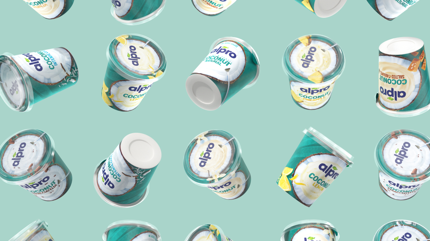
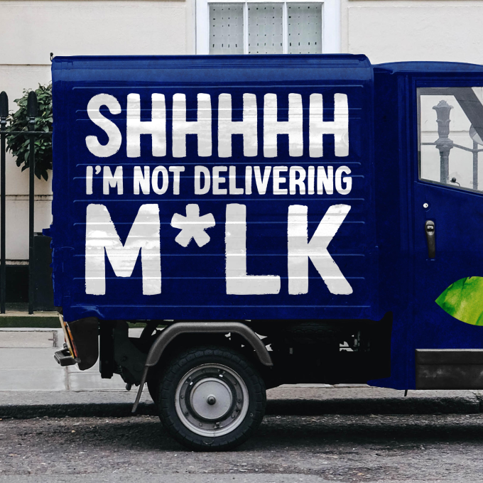
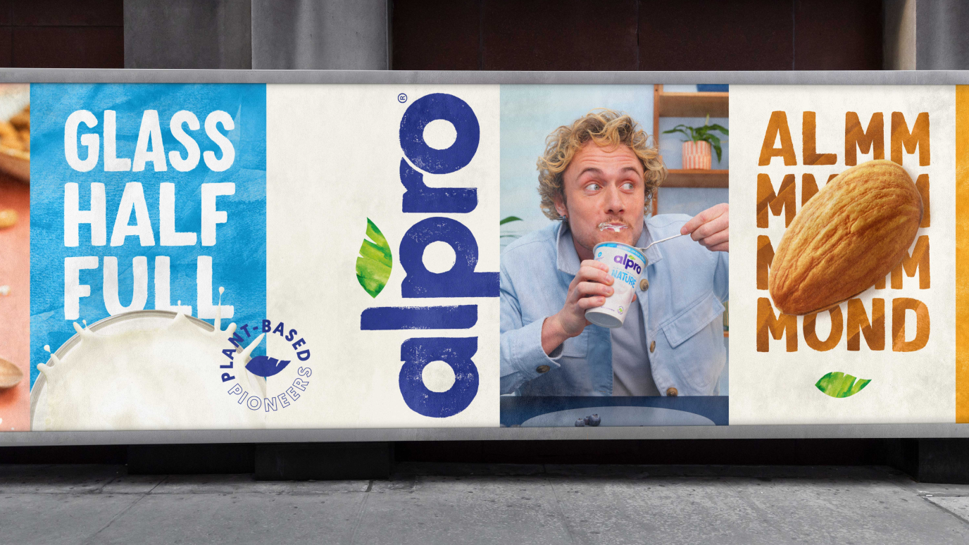
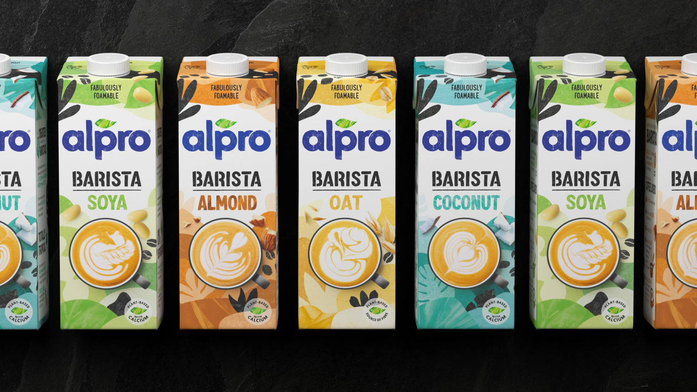
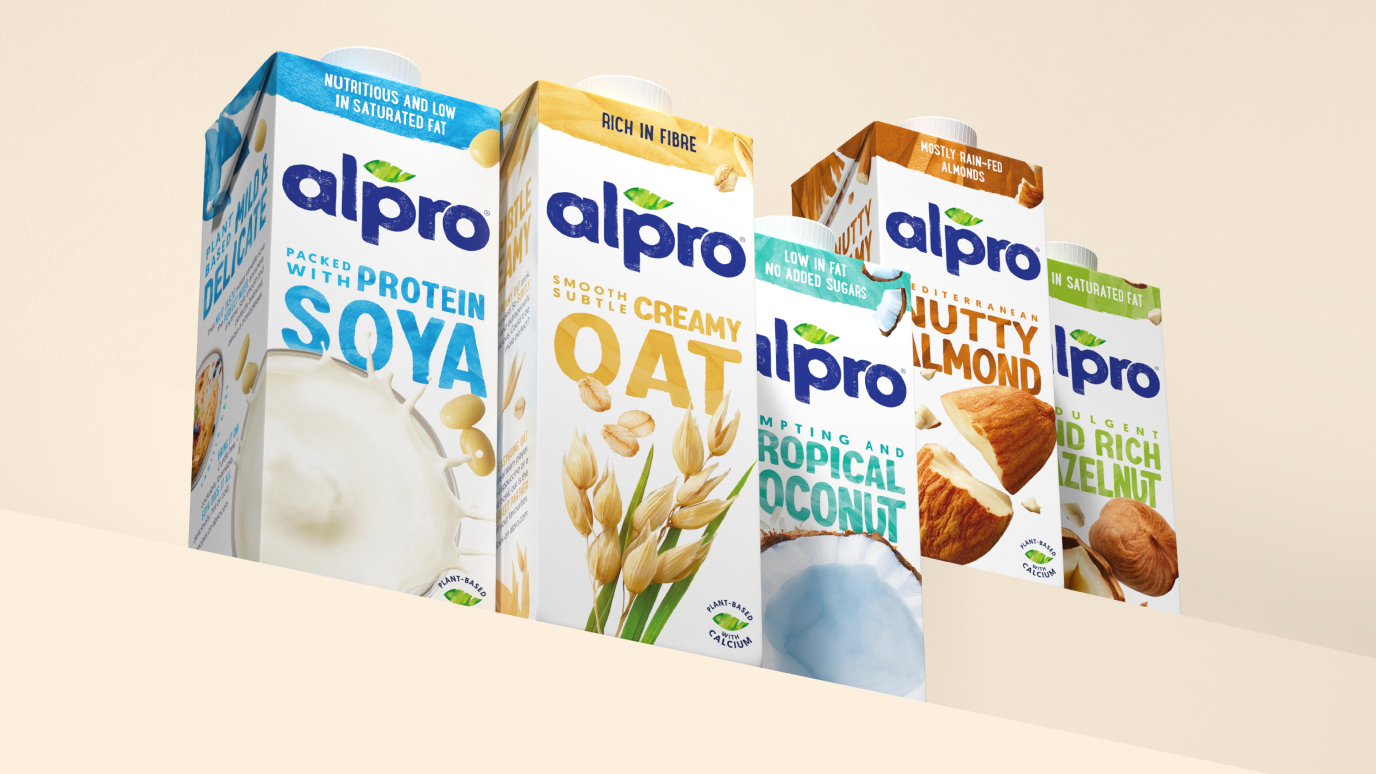
Alpro
When our London team was given the opportunity to work with Alpro, they recognised that the world of dairy and alternatives is changing, fast. A new plant-based movement has emerged, driven by people making more conscious plant-based choices. No longer considered as alternatives, this is a new category created from growing consumer awareness for health, animal welfare and the environment.
Alpro’s diverse and growing portfolio presented a need for an intuitive yet flexible design system and a design that could stand up against increasingly disruptive competition. It was time to shake up the category and reinstate Alpro as the plant-based leader through a revitalised visual identity.
A new set of challenger brands are growing the category, bringing with them challenger aesthetics; loud, bright, disruptive and attention-grabbing. We observed that while it is important to be contemporary and stand out, that the category lacked a sense of authenticity, credibility and naturalness. As the plant-based pioneer, we had a product truth that gave us the right to play in this space. It was this insight that inspired our direction for design.
Inspired by our plant-based product truth and the visual opportunity for authenticity, our design heroes nature, by celebrating the natural world and all its ‘perfect imperfections’. This concept is brought to life across all design elements; with an emphasis on white to denote naturalness and stand out, photography that heroes the real ingredients and a hand-crafted illustration style.
This creative idea was supported by a strong and flexible design strategy that ensures cohesion across a complex range and future-proofs our innovative pipeline.
We’ve broken out of a holding shape to enable freedom & flexibility, lino-cutting our word-marque by hand to represent craft and authenticity. We’ve retained and evolved the leaf into a more contemporary hand-painted aquarelle style, and retained the Alpro blue to ensure recognition.
We celebrate natural movement through a human-hand & aquarelle style.
We use top-down photography to hero ingredients and express their naturally tasty goodness.
Ingredients are raw yet refined, bringing to life our natural concept of perfect imperfections.
We hero white for distinctiveness in a world of loud challengers and to communicate naturalness.
Our simple system is easy to use yet flexible enough for portfolio extension, always heroing the key ingredient or product driver. Our consistent use of white, photography style, use of logo and aquarelle style all help us stand out in a crowded fixture.